New: Authentication Trend and IP Geography Maps
Two new visualizations make it faster to spot what changed in your DMARC reports, and where your traffic is really coming from.
A DMARC report table tells you what happened. It doesn't tell you, at a glance, when it happened or where from. Two new visualizations in DmarcSignal close that gap: an authentication trend chart on the By Report page, and a geography map on the By Source IP page.
By Report: See the trend, then jump straight to the records
The By Report page now opens with an Authentication Trend chart above the report table. It plots pass, fail, and misconfigured message counts across your selected date range, so spikes and dips are visible immediately instead of buried in rows of data.
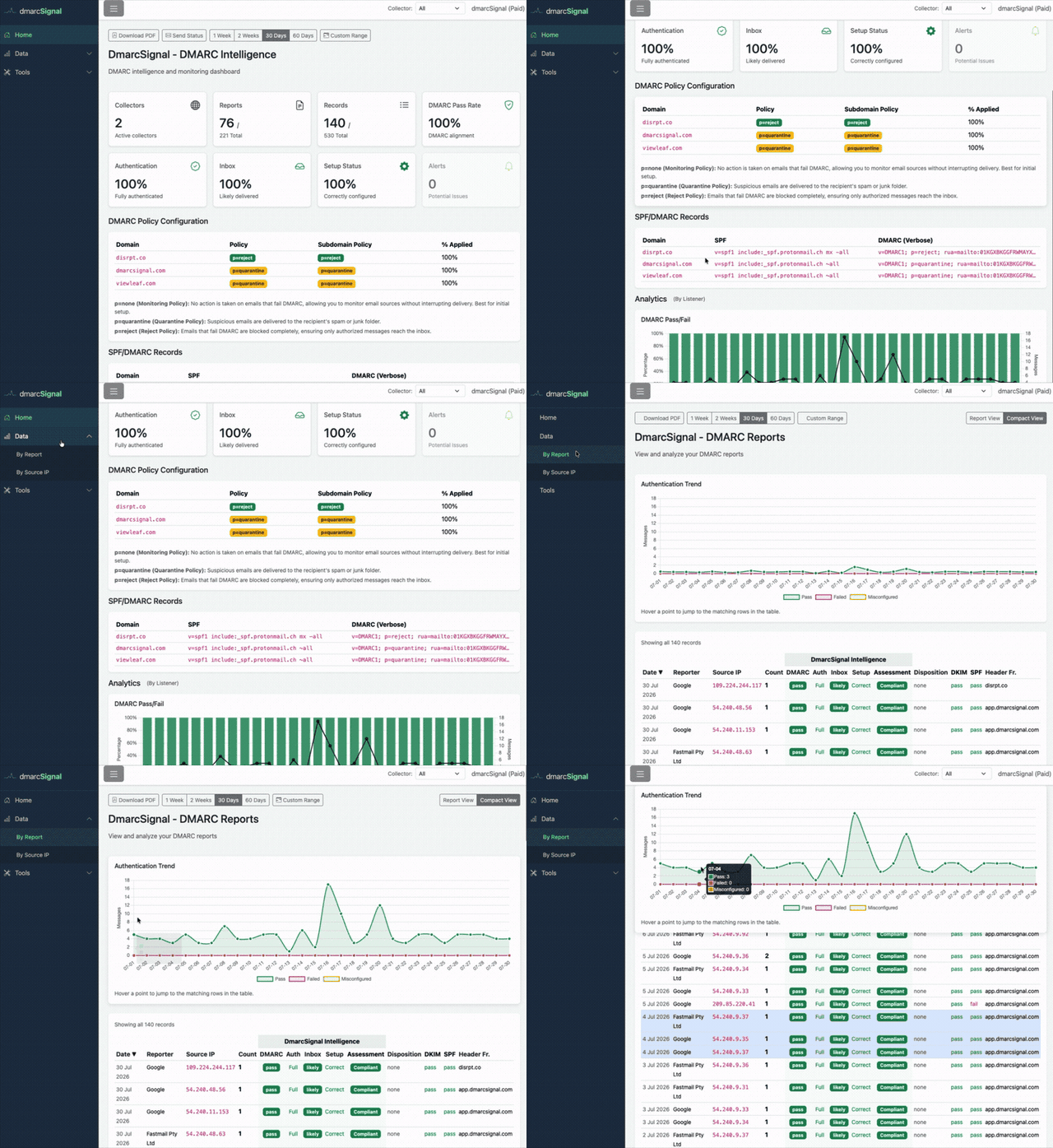
The useful part isn't the chart itself, it's the connection to the data underneath. Hover any point and DmarcSignal shows a tooltip with that day's counts, then scrolls the report table to the matching rows and highlights them. See a spike on the 16th, hover it, and the exact reports behind that spike are highlighted right below. No manual date filtering, no scanning hundreds of rows for the ones that match.
This matters most when something looks off. A sudden jump in failed messages is easy to notice on a chart and easy to miss in a table sorted by date or reporter. Now you can go from "something changed around the 16th" to the specific source IPs and reporters responsible in one hover.
By Source IP: A map of where your traffic actually comes from
The By Source IP page now includes an IPs by Country map above the table. It's a choropleth showing the number of distinct source IPs reporting mail against your domain, shaded by country, for your selected date range.
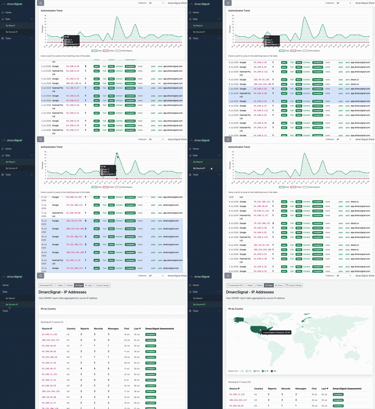
Most domains have a predictable mail footprint: your email provider, your marketing platform, maybe a CRM, all concentrated in a handful of countries where your infrastructure actually lives. The map makes that footprint visible immediately, and makes anything outside of it obvious too.
If your legitimate senders are all in the US and Western Europe, and the map shows shading somewhere your business has no presence, that's worth a look. It's the same signal you'd find by reading through individual failing records, just visible at a glance instead of requiring you to go looking for it.
Why this pairing works
These two visualizations answer different questions. The trend chart answers "when did this happen," the map answers "where is this coming from." Together they cover the two things you actually want to know when a DMARC report needs attention, without leaving the dashboard or exporting anything to a spreadsheet.
Both are live now on the By Report and By Source IP pages for every collector, on every account.
DmarcSignal provides free DMARC monitoring. Set up a collector, add it to your DNS, and start seeing your authentication trends and traffic geography for yourself.